
How to Frame Your Art
Why framing matters
Framing your posters is more than protection — it is a way to showcase and elevate the art you love. The right frame turns a single print into a considered piece and a wall into a gallery.
Whether you are a seasoned collector or just starting out, a few simple choices make all the difference: the frame colour, whether to add a passe-partout, and how pieces relate to each other on the wall.
Choosing a frame
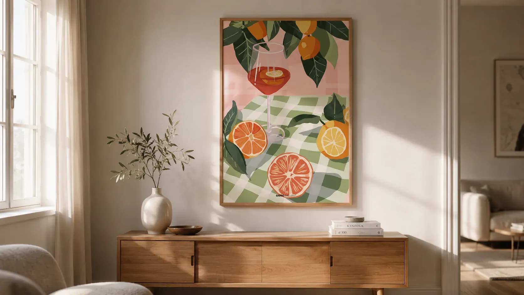
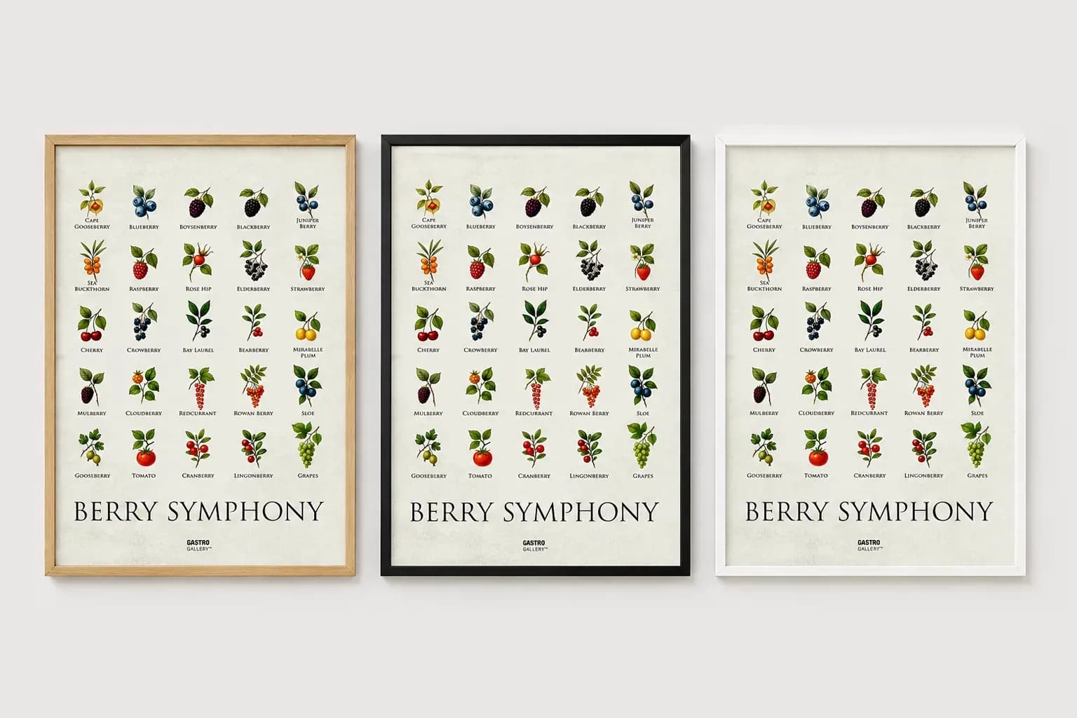
Match the frame to the poster size — a 50x70cm print fits a 50x70cm frame exactly, with no cropping needed. Light oak and ash feel warm and Scandinavian; black and dark oak add contrast and drama; white keeps things airy.
When in doubt, let the artwork lead. Quiet, tonal prints suit slim natural-wood frames, while bold graphic motifs can carry a heavier or darker moulding.
Adding a passe-partout
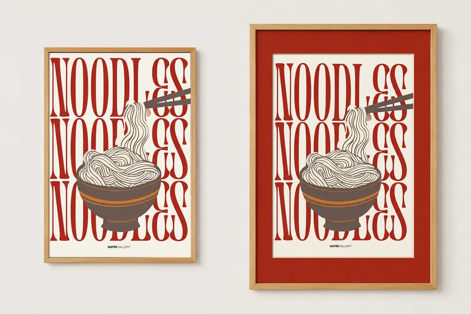
A passe-partout (mat board) sets the motif back from the frame and gives it room to breathe. A neutral white or off-white mat suits almost everything, while a soft pastel can echo a colour in the print for a more playful look.
Building a gallery wall
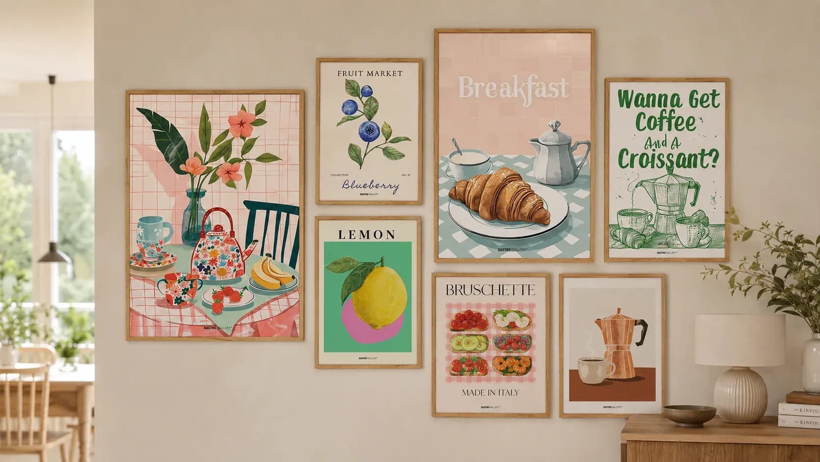
Start on the floor: arrange your frames before committing to nails. Keep an even gap — around 4-6cm — between pieces for a cohesive grid, or vary sizes for a relaxed, organic cluster.
Tie the group together with a shared thread: a common frame colour, a palette, or a theme. A mix of motif sizes with one repeated frame finish is a reliable, gallery-quality result.
Get more styling ideas
Guides, new arrivals and subscriber-only offers — about once a month.